Germany: Permanent construction site Lidl
- DRC Discount Retail Consulting GmbH

- Sep 12, 2020
- 4 min read
Updated: Sep 18, 2020
The in-store design of Germany's most ambitious discount developer is a continuous construction site. The in-store concepts and different tests changes more often than Lidl's top management team.
At least Lidl has been in a continuous process of change for years, which is regularly reported by DRC. Unlike many competitors in the industry, Lidl seems to have said goodbye to the idea of defining a standardised fixed in-store concept for all its stores and then sticking to it for a while. That is why Schwarz Gruppe recently set-up its new business division Schwarz Beschaffung GmbH, sourcing and selling more than 180,000 SKUs non-product related articles for Lidl and Kaufland, globally.
New elements are constantly being added and / or old ones kicked-out again. Lidl is practically the Mary Shelley of discount in-store design.
Currently, the renovations seem to be a bit more extensive than the last one, which can be read as a consistent readiness for modernization. Or as a basic nervousness, especially since some of it is reminiscent of measures that competitors have already implemented.
A few weeks ago the German branch magazine “Lebensmittel Zeitung” first reported on “test stores” in the south of Germany, in which product categories and customer guidance were newly sorted. In the meantime, modifications are also being made in reopened stores, in e.g. Berlin.

1. Fruit and vegetables: Now also in L
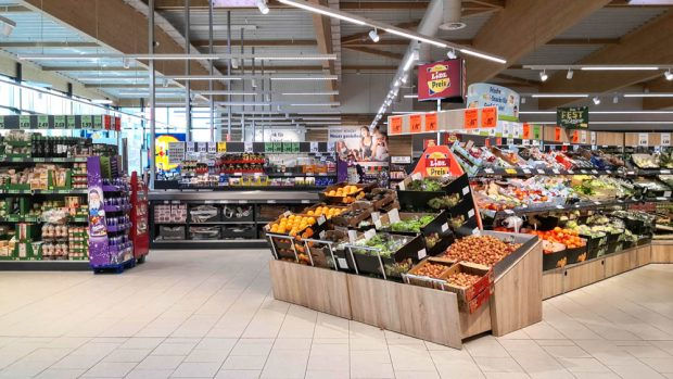
Lidl regularly positions its steadily growing SKUs in the category fresh fruits and vegetables at the store entrance. In the case of newly opened stores that offers a kind of freshness mole that stretches towards the entrance, across from the rounded ensemble of bake-off bread.

But some of the existing stores are also being re-arranged. Paprika, zucchini, carrots & Co. welcome customers: inside, for example, in an inverted L-shaped shelf arrangement. In addition, there is a central island that can be walked all around, very similar to how Hofer demonstrated in Austria and Aldi Süd has taken it up in its latest concept of fresh food stores.

The idea is therefore not entirely new, nor is the set-up necessarily clearer; But it looks a bit more like a regular supermarket and allows the fruit and vegetables category better stand out at the entrance of the store.
In some Lidl stores, the organic goods are also additionally positioned in a bio category block close to the fresh section.

Another new feature is that convenience snacks and drinks moved to a chilled section, which is right at the front of the store close to fruit and vegetables and bake-off bread. (Just like Aldi has been doing in its City of London stores)
When fruit and vegetables buckle in the store, something has to buckle on the other side as well - which undermines the well-known Lidl longitudinal shelf logistics, at least in the front area of the shop. But it looks very chic.
2. Product range labeling: say what's inside
In order not to let the shoppers and employees run too badly into disorientation, Lidl has decided to put a new color-coded category range indication directly above the shelves, and not just on the side walls.
Presented in the Lidl font it says what can be found on the shelf. The categorization is much more differentiated than the previous in-store shopper guidance. It is differentiated in sub-categories such as: "Milk and cream", "yoghurt and quark", "sweets and fruit gums", "paper and hygiene", "Noodles & Co." or just "tea". Which is quite practical. And was a little bit overdue.

3. Product presentation: active shelf rondel
Even if the originality of many (test) changes is limited, Lidl achieves directly visible changes. Especially in the area to the entrance side.
Here space reducing brackets for running and upcoming flyers are visible mounted for shoppers at the entrance and exit.

In the store the wine bottles are placed in a rondel shelf that is positioned at the top of the gondola, some of bottles standing, some laying in wooden boxes.

The "regional diversity" is explicitly emphasized - also in existing stores - by presenting the respective product category in a block at the top of the gondola.
4. (Frozen) cooling: Next generation chests
Speaking of refrigeration: the time of the deep freeze chest, into which shoppers had to bend deeply to take out the last promotional item, seem to go to an end. In the frozen category at the end of the store in front of the cash registers, Lidl relies on unrestrained vertical freezers with floor-to-ceiling doors, shelves and wire baskets.
In smaller stores pork, beef, poultry and fish are also sorted into full-length vertical refrigerator cabinets (with doors!) Here all fresh meat and fish categories have their own color coding (blue, yellow, red, light blue), see below.

In larger stores, Lidl use chilled cabinets that open to the side, see below.

5. Wood look: light but cheap
The wood look simulation are no longer just on the fruit and vegetable shelves and around the in&out promotional baskets but also on the walls in the cash register zone and PET bottle recycling area and around the bake-off area.
In addition, all price rails have been given the light wooden background, as have the new category range dividers on the shelves.

Lidl will continue with renovation in the next few months as the Mary Shelley of the German discount comes up with new ideas to tweak her in-store design.


Comments